
A good logo isn’t a shape someone liked in a mood board. It’s the result of a process — understanding a business, its market, and the person it needs to reach, then distilling that into something simple enough for a favicon and strong enough to carry a brand for years.
Here’s how that process works, step by step.
1. The Conversation
Every project starts with a conversation, not a brief template. We want to understand what the business actually does, the idea behind it, and whether there’s a story worth telling through the brand. We also talk about the person behind the business — because founders often end up reflected in their branding, whether they realize it or not.
We ask about color preferences, existing logos the client admires, and why they admire them. That “why” usually tells us more than the logo itself does.
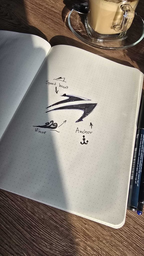
2. Mood Boards and Market Research
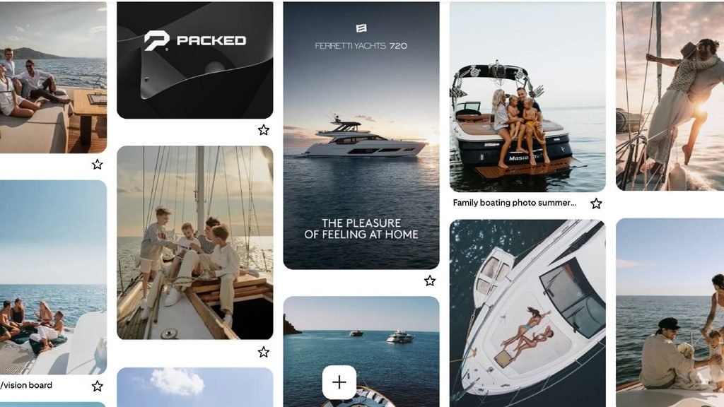
From that conversation, we build two mood boards. The first stays close to what was discussed — colors, textures, fonts, and a general direction pulled directly from the brief. The second is looser: our own interpretation, filtered through our design perspective, sometimes pushing the brand somewhere the client hasn’t considered yet.
Alongside the mood boards, we research the market. This does two things at once — it makes sure we’re not accidentally echoing a competitor, and it tells us whether there are visual conventions in that industry worth respecting (even if we don’t follow them exactly).
3. Building the Ideal Client Avatar
Before touching color or type, we define who the brand is actually speaking to. This isn’t a vague “target audience” — it’s a full avatar. Name, age, occupation, family status, the problems they face that relate to the business, and exactly how the business solves them.
A logo designed for “everyone” tends to say nothing to anyone. A logo designed for one specific person, standing in for a whole segment of real customers, ends up communicating far more clearly.
Not sure who your ideal client actually is? That’s often step one of a stronger brand. Let’s map it out together.
4. Merging Brand Vision and Mood Board
With the avatar defined, we go back to the mood boards and pull out what actually aligns — the colors, the tone, the visual language that fits both the brand’s identity and the person it needs to resonate with. This is also where we start defining the brand’s voice and tone, since a brand book isn’t just visual; it should guide how the business sounds, too.
5. Designing the Icon
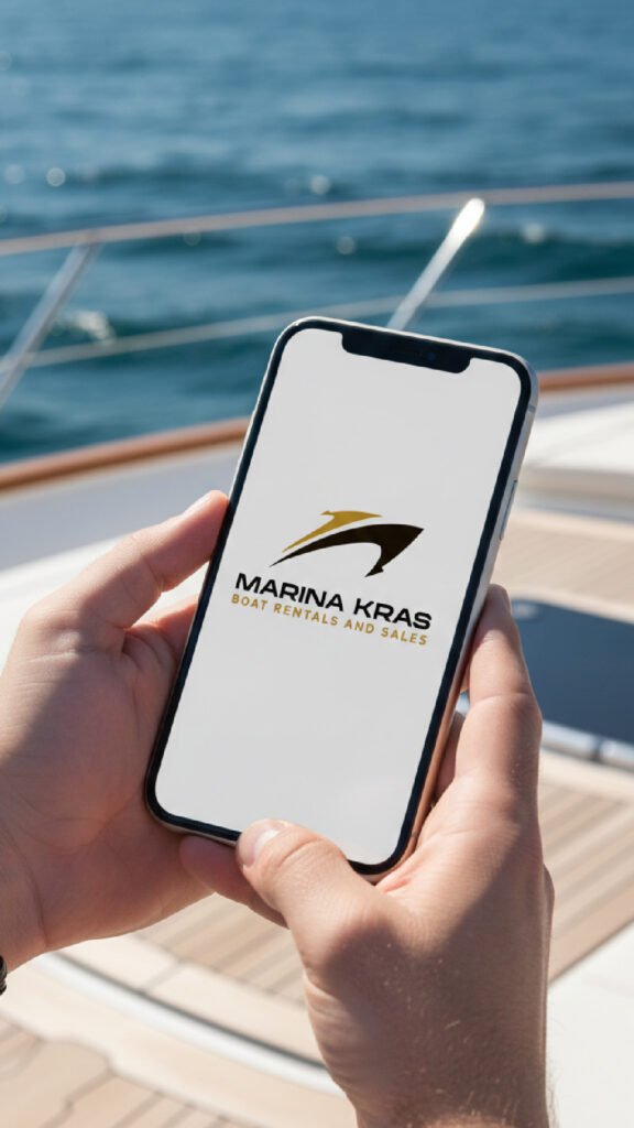
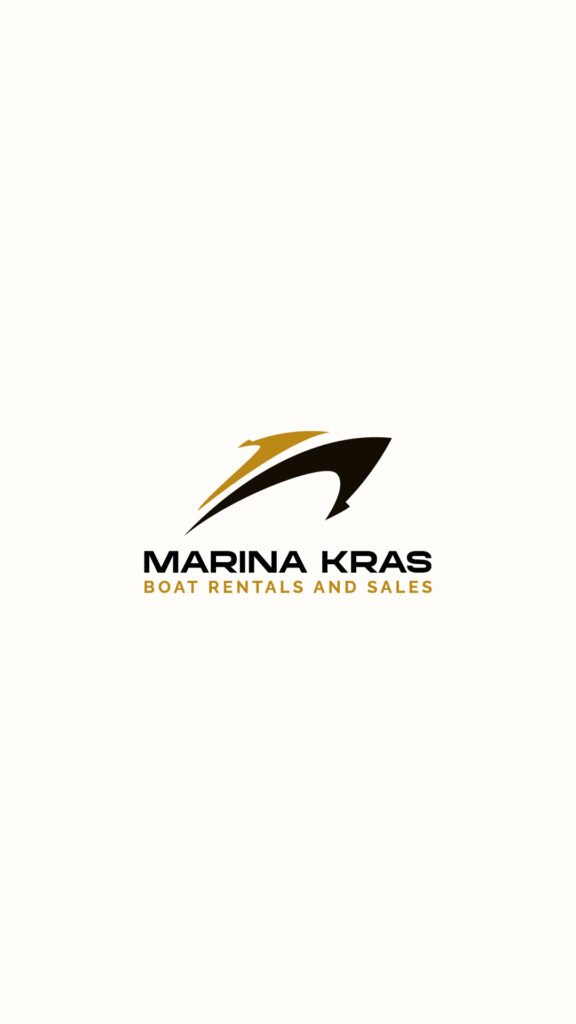
If the logo includes a symbol (not just typography), the icon carries roughly half the weight of the whole mark. It needs to hint at the business, its idea, or its name — without being too literal — while staying original, simple, modern, and memorable.
It also has to survive real-world use: full color, black and white, as a small social media avatar, as a website favicon, foil-stamped, embroidered, screen-printed. If it falls apart at any of those, it goes back to the drawing board.




6. Choosing the Typography
Next comes the font. It needs to be modern and legible, and it needs to genuinely appeal to both the client and the avatar we defined earlier. We typically customize it up to around 30% from its original form — enough to make it distinct and keep it clear of copyright issues, without breaking its readability.
7. Logo Layout and Spacing
Once the icon and typography exist, we work out how they sit together — proportions, spacing, alignment between symbol and text. This is a step a lot of designers rush, and it shows.
8. Real-World Applications
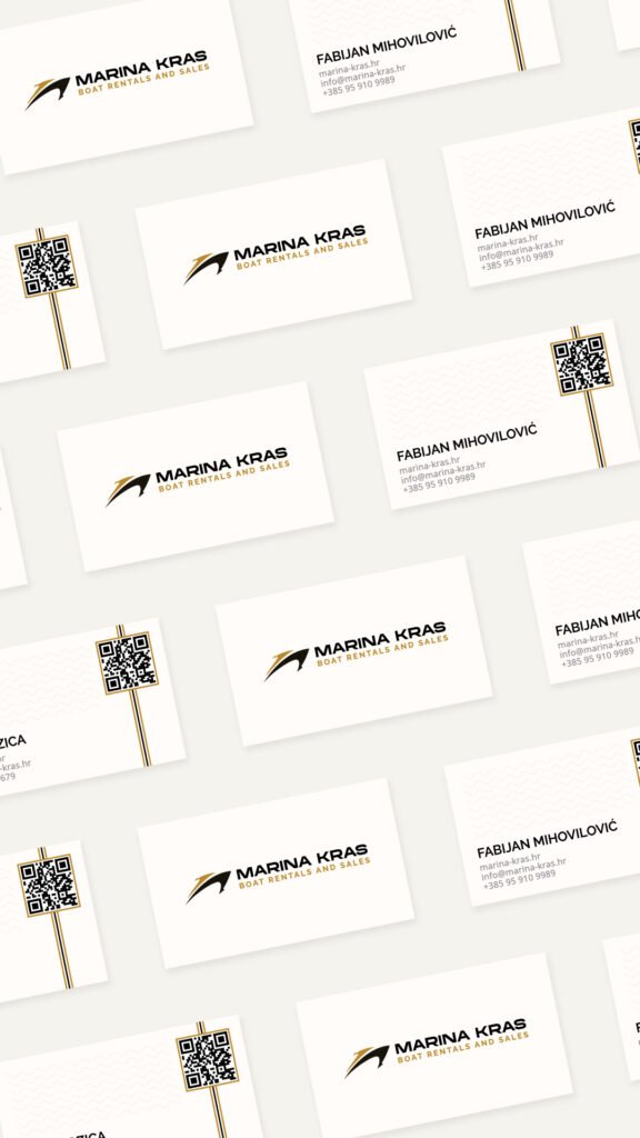
With the core logo locked in, we design how it shows up everywhere else: business cards, t-shirts, planners, caps, tote bags, mugs. Seeing a logo mocked up on real products is often the moment a client fully connects with the brand — it stops being an abstract file and starts being something tangible.
See this in action: browse our portfolio for full brand and website builds.
9. Patterns
Alongside the logo, we usually design a supporting pattern — a repeatable visual element built from the brand’s shapes, colors, or icon, used across packaging, backgrounds, social media, and other brand touchpoints.
10. Usage Guidelines
Every brand book includes clear rules for what to do and what to avoid — minimum sizes, clear space, incorrect color combinations, distortion, low-contrast placements. This section exists so the brand stays consistent no matter who’s applying it later, whether that’s the client themselves or another agency.
11. The Brand Book
Everything comes together in the final brand book: colors (with exact codes), typography, logo variations and construction rules, icon usage, patterns, and application examples. It’s the reference document that keeps the brand consistent for years, across every designer, printer, and platform it touches.
This takes longer than picking a font and calling it done. That’s the point — it’s the difference between a logo that looks nice for a week and a brand that still works five years later.
Ready to build yours? Start a project — or see our work first.